Create a Powerful Report From Survey Data
A killer survey report doesn’t just materialise out of thin air once the data is in. Its success is forged long before you even think about analysis. Honestly, the quality of your final report comes down to how clear your goals were from the get-go and how thoughtfully you designed your questions.
Think of it as the blueprint for turning a pile of raw responses into genuinely compelling insights.
Starting With a Clear Survey Strategy
Putting together a powerful report isn't just about showing off numbers; it’s about telling a story that answers a real, fundamental question for your business. If you don't have a clear purpose, you'll end up with a collection of interesting-but-useless data points. The whole thing has to start by defining what you need to know and, more importantly, why it matters.
This is all about being intentional. Every single question has to earn its place by linking directly back to your main objectives. A well-defined goal acts as a filter, helping you separate the must-ask questions from the "nice-to-haves." This focus stops the survey from ballooning out of control, which is a surefire way to cause survey fatigue and get dodgy data back.
Define Your Core Objectives
Before you write a single question, stop and ask yourself: What decision will this survey help us make?
Your objectives need to be specific, measurable, and actionable. Don't settle for vague goals like "understand customer satisfaction." That’s far too fluffy. Aim for something concrete, like, "Identify the top three friction points in our checkout process to slash cart abandonment by 15%."
- Business Goal: What key performance indicator (KPI) are you actually trying to move?
- Audience Insight: What specific behaviour or perception do you need to get inside?
- Desired Outcome: What action are you prepared to take based on what you find out?
A survey without a clear objective is like a ship without a rudder. You’ll collect a lot of information but have no clue how to use it to get where you want to go.
Understand Your Audience Deeply
Knowing your audience inside and out is non-negotiable. Their world, their language, and their motivations all shape how they’ll interpret and answer your questions. It seems obvious, but it’s so often overlooked.
A survey for long-term, loyal customers should sound completely different from one aimed at brand-new trial users. This deep understanding also changes how you interpret the data later on.
For example, large-scale national surveys are critical for policy-making precisely because they capture the nuances of a vast, diverse population. The 2011 Census recorded the population of England and Wales at around 56 million, a 7.1% increase from 2001. That wasn't just a number; it was essential data that directly influenced how the government allocated resources. You can learn more about how the Office for National Statistics uses this kind of data by exploring their historic census information.
Nailing this strategic phase is what ensures the data you collect is clean, relevant, and ready for analysis. And when you're ready to turn those powerful survey insights into testimonials that build trust, a dedicated platform like GoodKudos can make all the difference.
Turning Raw Data Into Actionable Insights
Collecting a mountain of survey responses is one thing. But the real magic happens when you turn that raw, messy data into something that can actually guide your business decisions. This isn't about becoming a statistician overnight; it's about methodically sifting, sorting, and making sense of what people have told you.
The first, non-negotiable step is data cleaning. You've got to go through your responses and spot the gremlins. I'm talking about incomplete answers, gibberish text entries, or those wild outliers that can throw everything off. For instance, if you ask for a satisfaction rating on a 1-10 scale and someone puts "99", that’s almost certainly a typo. It needs to be fixed or removed to protect the integrity of your report from survey.
Uncovering Trends in Your Data
Once your data is tidy, you can start hunting for the good stuff: the patterns. A surprisingly powerful way to do this with your quantitative data is cross-tabulation. It sounds technical, but it’s just comparing two different questions to see how they relate to each other.
Imagine you're looking at customer feedback. You could cross-tabulate "Overall Satisfaction Score" against "Customer Since..." and suddenly realise that your long-term clients are significantly happier (or unhappier) than your new ones. Finding these hidden connections is what turns a simple data summary into a strategic goldmine.
The infographic below really nails how this analysis phase is built on a solid foundation, connecting your initial goals to your audience and survey design.
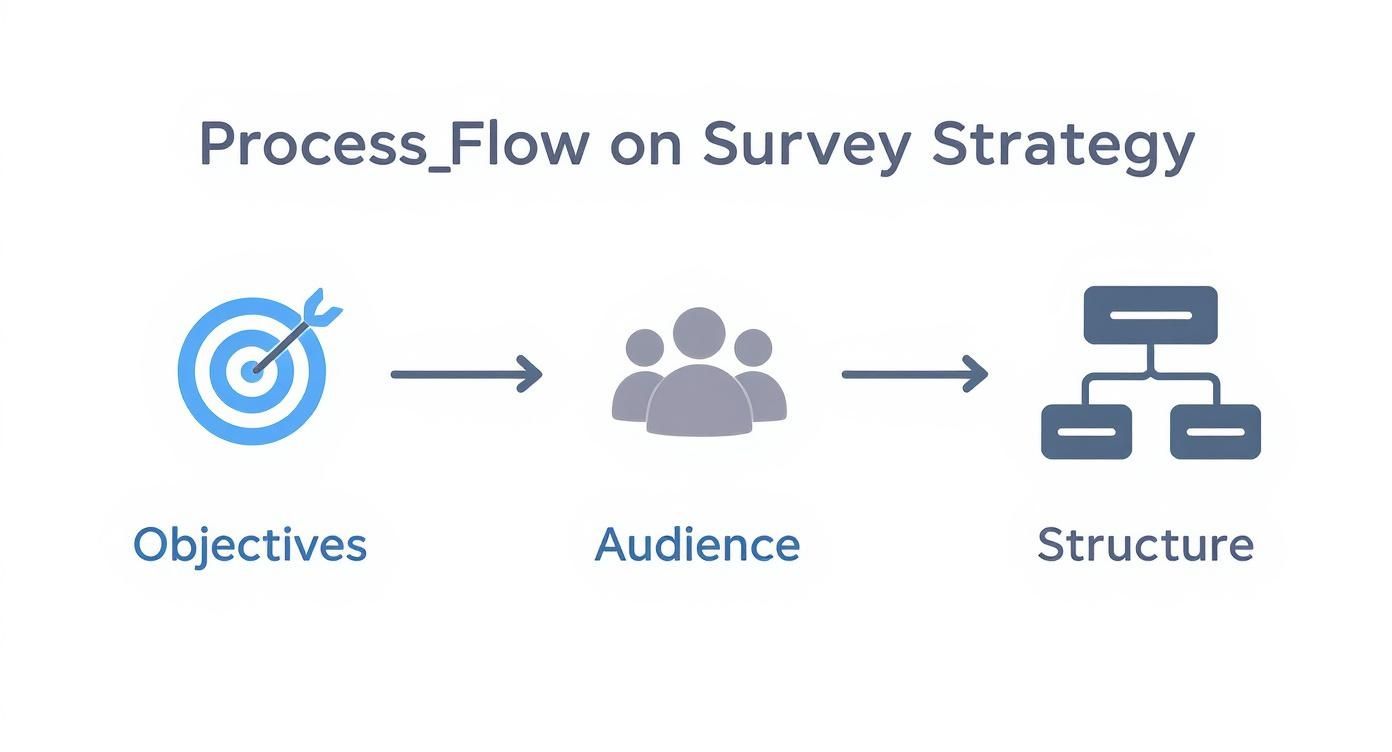
It’s a great reminder that you can't get brilliant insights at the end if you didn't have a clear strategy from the start.
Choosing Your Analysis Method
Picking the right technique depends entirely on the type of data you have and what you want to uncover. Some methods are great for spotting broad trends in numbers, while others are designed to dig into the nuances of written feedback.
| Data Type | Analysis Method | Best For Finding | Example Use Case |
|---|---|---|---|
| Quantitative | Descriptive Statistics | A high-level overview of your data (mean, median, mode). | Calculating the average customer satisfaction score. |
| Quantitative | Cross-Tabulation | Relationships and comparisons between two variables. | Seeing if new customers prefer different features than long-term ones. |
| Qualitative | Thematic Analysis | Common themes and recurring ideas in open-ended feedback. | Grouping comments about your app into categories like "bug reports" or "feature requests". |
| Qualitative | Sentiment Analysis | The overall emotional tone (positive, negative, neutral) of text. | Quickly gauging whether feedback about a new product launch is generally positive or negative. |
Ultimately, a mix of methods often yields the richest story. Use quantitative analysis to find the "what," and qualitative analysis to understand the "why."
Decoding the 'Why' Behind the Numbers
Numbers tell you what is happening. Your open-ended questions, the qualitative stuff, tell you why. This is where you find the stories that numbers alone can’t tell. The trick is to group all those individual comments into meaningful themes.
Don't just present a long list of quotes. Read through everything and start creating buckets. For example, feedback on a new piece of software might naturally fall into themes like:
- Feature Requests: "I wish it could do X."
- User Interface (UI) Confusion: "I couldn't find the settings menu."
- Performance Issues: "The app feels slow when I load my projects."
- Positive Praise: "The new dashboard is a game-changer!"
This kind of thematic analysis transforms a daunting wall of text into organised, actionable feedback.
The goal isn't just to report that 25% of users are unhappy. It’s to explain that their frustration is coming from confusion around the new UI update. Now you have a specific problem you can go and solve.
This is exactly how large-scale national surveys provide such detailed pictures of society. For example, the UK Annual Population Survey (APS) showed the national employment rate was around 75.5% in 2023, but more importantly, it revealed huge differences between regions. That level of detail helps policymakers understand what’s really happening beyond the headline number. You can see how this kind of data informs national strategy for yourself.
By blending clean quantitative data with rich qualitative themes, you build a complete narrative. This dual-pronged approach ensures your report from survey is not just accurate but truly insightful, giving you a solid foundation for making smart decisions. And when those decisions make your customers happy, capturing their stories is the perfect next step. A platform like GoodKudos makes it effortless to collect that positive feedback and turn your survey insights into powerful social proof.
Designing a Report That People Actually Read
You’ve done the hard work. You’ve crunched the numbers and pulled out some killer insights. But here’s the thing: none of that matters if your findings are buried in a dense, uninspired document that nobody wants to read.
Presentation is everything. A well-designed report from survey doesn’t just spit out data; it tells a compelling visual story. It guides your audience to the right conclusions and makes your findings feel intuitive and impossible to ignore.
Let's move beyond default spreadsheet charts and start thinking like a designer. It's all about clarity, emphasis, and creating a narrative that sticks.
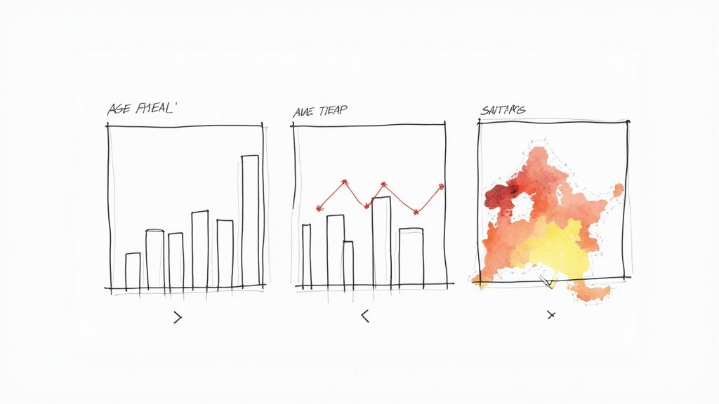
Choosing the Right Visual for Your Data
Not all charts are created equal, and picking the right one is the first step in telling a clear story. The wrong choice can easily confuse your audience or, even worse, misrepresent your findings completely.
Think of each chart as a different tool in your storytelling kit.
- Bar Charts: These are your workhorse for clear comparisons between different categories. Perfect for showing which option in a multiple-choice question was most popular or for comparing satisfaction scores across customer segments.
- Line Charts: Got data over time? Use a line chart. If you’ve run the same survey quarterly, a line chart is the ideal way to show how customer sentiment has shifted. It’s all about tracking those trends.
- Pie Charts: Use these sparingly. Seriously. They only work when you’re showing parts of a whole that add up to 100%, and even then, they're best with just a few distinct categories. Anymore than that and they become a cluttered, unreadable mess.
- Heat Maps: These are brilliant for revealing intensity or concentration. A heat map can quickly show you where users are clicking on a webpage mock-up or highlight the most frequently used words in open-ended feedback.
Your job is to pick the tool that makes your key message pop, requiring the least amount of effort from your reader.
Guiding the Eye with Smart Design
Great report design isn’t about being flashy; it’s about being intentional. A few simple design principles can transform a confusing data dump into a professional, persuasive document that guides your reader’s attention exactly where you want it.
First up, whitespace. Giving your charts and text room to breathe prevents the page from feeling cluttered and overwhelming. It’s a simple trick, but it makes your content instantly more approachable and easier to digest.
Next, be strategic with colour. Don't just throw your brand’s entire palette at the page. Instead, use a limited, consistent palette where colour has a purpose. For example, use a single standout colour like blue to highlight your company’s performance against a competitor, shown in a neutral grey.
The most effective visualisations are often the simplest. Your primary objective is clarity, not complexity. If a stakeholder has to spend more than a few seconds trying to understand a chart, its design has failed.
Create a Powerful One-Page Summary
Let’s be realistic: your busiest stakeholders might never read the full report. That’s why a powerful one-page dashboard or executive summary is non-negotiable. Think of it as your report’s headline act.
This single page should pull together your most critical findings into a scannable, visually engaging summary. Combine a few key charts with concise text callouts to present the main takeaways at a glance. It should answer the most urgent questions and point towards your recommendations without anyone needing to do a deep dive.
This summary ensures your core message gets through to everyone, making your work far more impactful. And when your survey uncovers glowing feedback, turning those insights into compelling testimonials is the perfect next step. Platforms like GoodKudos can help you effortlessly showcase that customer proof, amplifying the positive impact of your findings.
Weaving Your Data Into a Compelling Story

Let's be honest: a great report from survey data isn't just a data dump. It's a persuasive story. You’ve got the numbers and the visuals, but now the real work begins—weaving them into a narrative that grabs attention and actually inspires action. This is where you translate cold statistics into a clear story that resonates with everyone, from the CEO down to the marketing team.
Your narrative structure is the framework that holds it all together. It’s what guides your reader from the "what" (the data) to the "so what" (the insight), ensuring your key messages land with real impact. Without a logical flow, your audience will get lost in the details, and your hard work will be for nothing.
Start with a Powerful Executive Summary
Never, ever assume your audience will read the entire document. The executive summary is easily the most important section because, for many stakeholders, it will be the only section they read. It absolutely has to be a concise, standalone overview of the whole story.
Think of it as the trailer for your report. You need to briefly state the survey's purpose, highlight the most critical findings, and get straight to your core recommendations. Keep it sharp, focused, and completely free of jargon.
Frame Findings as Thematic Insights
Instead of presenting data point by data point—which is a surefire way to make eyes glaze over—group your findings into cohesive themes. This is the difference between listing out ingredients and presenting a fully-baked cake. Each theme should tell a mini-story, supported by multiple data points and your best visuals.
For instance, a theme could be "Renewed Focus on Customer Support Drives Loyalty." Under this heading, you’d pull together all the relevant evidence:
- The chart showing a 15% increase in satisfaction among customers who contacted support.
- A few powerful qualitative quotes praising the speed and helpfulness of your team.
- The data showing that these satisfied customers have a 20% higher repeat purchase rate.
This thematic approach turns isolated facts into a connected narrative that is far easier for people to understand, remember, and act on.
A report is not a collection of facts; it is an argument supported by facts. Your job as the author is to build that argument logically and persuasively, guiding the reader to an inevitable and clear conclusion.
Add Context to Make Data Meaningful
Data rarely means much in isolation. The real power of a report from survey data comes alive when you add context. How do your results stack up against last quarter’s performance or wider industry benchmarks? This comparison is what gives your numbers weight and urgency.
Think about how national economic surveys provide critical context for policymakers. The Bank of England's quarterly Inflation Attitudes Survey found that median inflation expectations were holding high at around 4.2%. That single statistic is far more powerful when compared to the government's 2% target, providing clear evidence for monetary policy decisions. If you want to see how this data shapes the UK economy, you can explore the research datasets from the Bank of England.
In the same way, if your Net Promoter Score (NPS) is 45, tell your audience if that's a solid improvement from last year or how it compares to your main competitors. This context transforms a simple number into a meaningful performance indicator.
By building a clear narrative, you ensure your hard-won insights don't just get reported; they get understood, discussed, and acted upon. And when those actions lead to delighted customers, you can capture their stories with a tool like GoodKudos, turning your survey's success into compelling social proof.
Putting Your Report to Work
Right, you’ve done the hard work. You’ve built the survey, gathered the responses, and crunched the numbers into a brilliant report. But let’s be honest, that’s only half the battle.
A report sitting in a folder doesn't change anything. Its real value comes to life when the right people see it, get it, and feel that little spark that makes them want to take action. This final step is all about getting your insights out of the spreadsheet and into the conversations that actually matter.
Effective sharing isn't just about attaching a PDF to an email and hoping for the best. It’s about being strategic, choosing the right format for the right audience, and presenting your findings in a way that kicks off a productive discussion. Get this right, and your hard work will translate into real-world results.
Get the Format Right for Your Audience
Think about who you’re sharing this with. Different people need different things from your report, and a one-size-fits-all approach is a recipe for being ignored. Your executive team probably wants a quick, scannable summary they can digest in five minutes, while the project team needs to get into the nitty-gritty to figure out what to do next.
Here are a few ways you can package your report from survey findings:
- The Interactive Dashboard: If this is for an ongoing project, a live, web-based dashboard is a game-changer. It lets stakeholders play with the data themselves, filtering by date or demographic. This hands-on approach creates a much deeper sense of engagement and ownership.
- The Classic PDF: There's a reason this format is still around. A well-designed, easy-to-share PDF is perfect for formal presentations or for anyone who needs a static, printable record of what you found. It’s clean, professional, and reliable.
- The Presentation Deck: When you've got a meeting booked to discuss the results, a slide deck is your best friend. The trick is to keep it simple. Each slide should hammer home a single, powerful insight, pairing a key visual with just enough text to tell the story. Let your voice do the rest.
Presenting to Spark Action, Not Yawns
Sharing your report often leads to one thing: a meeting. This is your moment to bring the data to life. You’re not just there to read your slides; you’re there to provide context, answer questions, and steer the conversation towards clear next steps.
Kick things off by reminding everyone why you did the survey in the first place. This grounds the room and focuses the discussion. Then, walk them through your key findings, but always tie them back to the impact on the business. Be ready for questions, and most importantly, come prepared with a few clear, data-backed recommendations.
The goal isn’t just to inform; it’s to persuade. Frame your insights as opportunities and present your recommendations as the obvious path to grabbing them.
One of the most valuable things you can find in a survey is glowing feedback. These little gold nuggets are assets that can build trust and bring in new customers. Don't just let them sit there in a report—put them to work!
This is exactly what platforms like GoodKudos are built for. You can take those positive survey responses and easily turn them into compelling testimonials. Embed them directly on your website, and you’ve just transformed your research insights into powerful marketing tools that actually drive growth.
A Few Common Questions About Survey Reporting
Even with a solid plan, a few tricky questions always seem to pop up when you’re turning raw data into a polished report. Getting these final details right is what separates a decent report from one that actually gets people to act.
Think of this as a quick guide to clearing those final hurdles and making sure your report hits the mark.
How Long Should My Survey Report Be?
Honestly, there’s no magic number. The right length comes down to who’s reading it and what you need them to do.
If you’re presenting to the leadership team, they probably want a single, scannable page. Just the highlights, the most critical findings, and what you think should happen next. They need the big picture, fast.
But for a project team that needs to dig into the details, a 10-20 page document with deep-dive data and appendices might be exactly what’s needed. The golden rule is this: be as brief as you can without losing the essential story. Your goal is clarity, not a high page count.
The biggest trap I see people fall into is confirmation bias—where you only look for data that backs up what you already believe. You have to fight that urge. Go in with genuine curiosity and actively look for the results you didn't expect.
How Do I Present Negative Survey Results?
It’s tempting to sweep negative feedback under the rug, but that’s a huge mistake. Being transparent is how you build trust, and frankly, it’s where the most valuable insights are usually hiding. The key is to frame it constructively.
Never, ever just drop a problem on the table without offering a way forward.
Instead, when you present a negative finding, immediately follow it up with a smart insight and a proactive recommendation. For example, instead of just saying, "Customer satisfaction with our support dropped 20%," reframe it as an opportunity.
- The Finding: "Our data shows a 20% drop in support satisfaction this quarter."
- The Insight: "This lines up with a 30% spike in ticket volume right after we launched the new feature."
- The Recommendation: "We should look into a new ticketing system to help the team manage the higher volume and get response times back on track."
See the difference? This approach shows you’ve not only spotted an issue but have also thought critically about how to solve it. It turns a scary data point from your report from survey into a catalyst for real, positive change. By tackling the tough stuff head-on, you create a report that doesn't just inform—it inspires action.
When your surveys uncover those amazing positive stories, Good Kudos makes it incredibly easy to capture them and turn them into powerful social proof. Showcase your customer love and build trust by checking out what we do at https://goodkudos.com.